Documentation for 30MFF Website
Project Description:
This 30MFF World Premiere Website is a display of the Starbucks Coffee advertising film the Cafe Latte Fantasy. The theme of the website is aligned with the film, which is "different choices lead to different consequences, even the action is simply buying a bottle of Cafe Latte". As for the function, the website serves as a platform for the audience to watch the film, understand and further think about the theme of the film. The provision helps audience to think about Starbucks Coffee more often, and thus raises audience's Starbucks Coffee brand awareness, as well as give Starbucks Coffee personalities or characteristics, which are wild imagination and unexpected possibilities.
Process:
The website is divided into five parts, which are Home, Introduction, Film, Behind the Scenes, and About. Different from traditional website on which each part occupies one page, this website put all the parts into one page, from the top to bottom. The purpose of this design is to guide the audience from being new to the film and perhaps to the Starbucks Coffee to knowing the film and the brand quite well in a smooth experience within one page. To enhance this experience, I created the slogan of the website, Step into the world of Fantasy, and put it on the home section, which navigates the audience to dive into the Starbucks world and get to know and think from then on. The smooth scroll behavior enhances this concept, as the scrolling of the page when the audience click on different parts mimics the behavior of taking a step.
The color of the website is mainly the "Starbucks Green (#00704a)", white, light grey (#F1F1F1), and black. This combination of the color is to slightly remind audience of Starbucks and thus leave Starbucks in their mind unconsciously. However, I used the light grey and white more than the "Starbucks Green" in order to avoid showing my real purpose of the website apparently. Too much reminders might make audience to leave the website since they only regard it as a commercial advertising website.
The content of the website follows the structure of a film page on the film database site(See IMDb). Before showing the film, the Introduction part gives audience a basic knowledge of the film, and addresses the emotion of film. The trailer and the summary of the film manifest that the film is relaxing and has unrealistic parts. The film reviews are written by two of my friends who had actual screening experience in advance, and they wrote down the review after watching my film. Therefore, their comments are from the aspect of the audience, which can tell the actual audience what to expect in the film. The first three parts address the audience the information of wild imagination. The "inexpensive" gun-shooting scene, the backward scene and the exaggerating acting in the film and the Starbuck-related design of the website might leave people the impression of funny and crazy. The Behind the Scenes part after the Film part tells another aspect. I wrote about the coincidence when shooting the film and included my inner activity when observing that my role was accidentally replaced by a "real" person instead of the script-driven actor or actress. Having known this story, the audience might have a sense of breaking the boundary line of reality and the fantasy, and further think of the different possibilities of accepting or denying this coincidence. I wrote my feeling, "you never know what will happen next even as a simple action of buying Starbucks" in the last part, hoping to inspire the audience. This is also a slight reminder of the advertisement of Starbucks coffee, in order to link the feeling with the brand.
The heading of each part is composed of the heading text and the content-related picture:
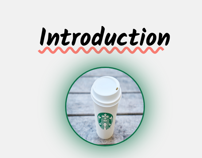
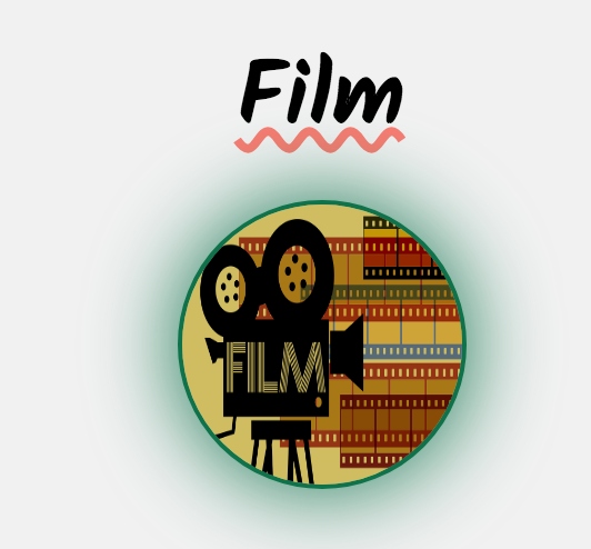
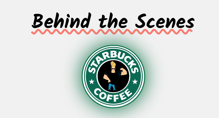
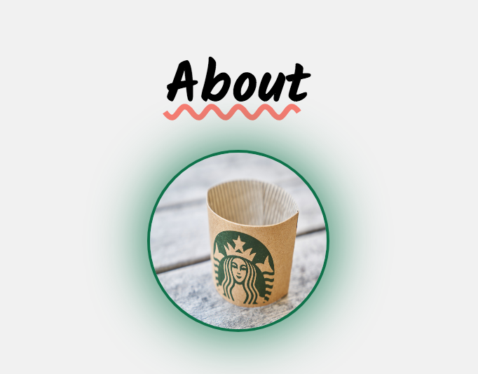
This style of the design shows the Starbucks Coffee theme by presenting the "Starbucks Green", and the picture of each heading has relation with the content. To be specific, the picture of the Introduction part is a simple bottle of Starbucks Cafe Latte, which shows that the Introduction part introduces the basic information of the film. The text "Film" in the picture of the film part clearly tells the audience the content. The third one is a funny muscle man who is surrounded by Starbucks sign, which mans that the Behind the Scenes part reveals some interesing stories behind. The fourth one, which I like the most, is Starbucks cup sleeves which usually covers the bottle in case of the high temperature of the coffee. The missing of the bottle gives this picture a sense of white space, making me and perhaps audience feel that the film has ended, but there is somethiing that they can think about by themselves. All the pictures on the website are under Creative Common license.
Reflection/Evaluation:
Of course, when we were shooting the film, we didn't have the intention of promoting Starbucks. We relied on the Cafe Latte, which we were familiar with and could happily add wild plot with. I came up this idea of branding and promoting on my half way of building the website, as I found that my friends naturally considered about the website's relation with Starbucks Coffee, therefore, why not I used my knowledge to build a brand concept website, making the film serve as an emotion-related advertisement?
I am satisfied that I found the theme "wild imagination and unexpected possibilities", and used it as the emotion (or the perception) the Starbucks Coffee wanted to address. However, the layout and the position of the website, especially when I squeezed the window from the right to left, were not so satisfying. The layout becomes messy when I do that, and this is what I can and should improve in the future. In addition, the current version allows the audience to directly go to the Film part. This is also a problem because my whole website offers the audience a journey, and they might not get what I want to address if only watch the film. Without the limitation of my skill, I might edit the Film part as only people who finished reading the Introduction and watching the trailer could watch the film. In addition, I might make the Film part as only people who logged in or signed up could watch the film, and this was due to the business purpose, which is to keep contacting or interacting with them.
One coding problem is about the class. I found that even if I wrote the correct code, sometimes the Sublime Text will consider the class ends when it is actually not. This becomes a big problem for me because some structures that need to be consistent disappear on the website. I solved the problem by changing the class name into different names (previously because I wanted every section be the same structure, I used the class name .card everytime). However, this solution didn't apply when I met the problem for the second time in the last part. Therefore, I am wondering a better solution to this problem.
The last problem is that when I was building the website, I could feel clearly that I sometimes didn't know how to achieve my goal of addressing the theme. This was due to my lack of aesthetic feeling and lack of knowledge of how to design. I could improve this by looking through different templates and examples.
In all, this was a great experience for me to think about the film and website, and how to brand or characterize them. I hope I can gain more aesthetic knowledge as well as increase the coding skills. How to be organized, accurate and creative is always my biggest question.